The Dodo Digest: The Hidden Conversion Killer for AI Startups


TL;DR:
AI agents are starting to browse the internet and complete tasks, but payments will always remain a human trust moment. And right now, that moment is fragile: ~70% of checkouts get abandoned due to lack of trust signals.
A good checkout needs five things: clear pricing, minimal friction, strong trust signals, the right payment methods, and design consistency with your product.
Dodo Payments’ latest update tackles this with a Unified Design Hub and along with credit-based billing, help teams ship a cleaner, more trustworthy payment experience.
Also, stay till the end - there’s a small riddle with a prize on the line.
Hello everyone,
Last night I was on a call with a friend who’s been building something genuinely interesting, a payment infrastructure for AI agents to transact with each other on Moltbook.
It was a fascinating conversation. And somewhere in the middle of it, a thought crept in that I haven’t been able to shake since:
Will humans eventually just… step out of the payment loop entirely?
I sat with that for a second. And honestly? I don’t think so.
Here’s why. Payments aren’t just a technical exchange. They’re a moment of trust. The second money moves, something psychological happens, a little voice in your head asking “wait, is this right? Is this safe? Do I actually want this?” That voice is human.
No matter how much of the buying journey gets automated, the checkout page will always have a human touch. Someone who pauses, reads the total one more time, checks if the page feels right and only then hits pay.
That conversation made it click for me why that feeling matters so much.
The Checkout Problem Was Already Bad. Now It’s Urgent.
Three things came together this week that paint a pretty clear picture of where things are headed.
One. OpenAI shipped GPT-5.4 with native computer use. Not “computer use as a research preview.” Production-grade, API-accessible agents that can now navigate apps and click buttons. It scored 75% on OSWorld, beating the reported human baseline of 72.4%.
Two. Meta acquired Moltbook, a Reddit-like platform where AI agents post, comment, and vote with each other. Humans mostly just watch.
Three. GTC 2026 starts Monday. Jensen Huang is teasing a chip reveal, and Nvidia is launching NemoClaw, an open-source platform for AI agents that can plan, decide, and execute multi-step workflows.
The agentic web isn’t a concept anymore. It’s infrastructure.
But here’s what struck me sitting with all of this - even as agents get better at navigating the internet, the checkout moment is still deeply human. And the numbers show just how fragile that moment already is.
Around 70% of checkouts get abandoned. Not because people changed their minds about the product. Because something at the checkout page broke their confidence.
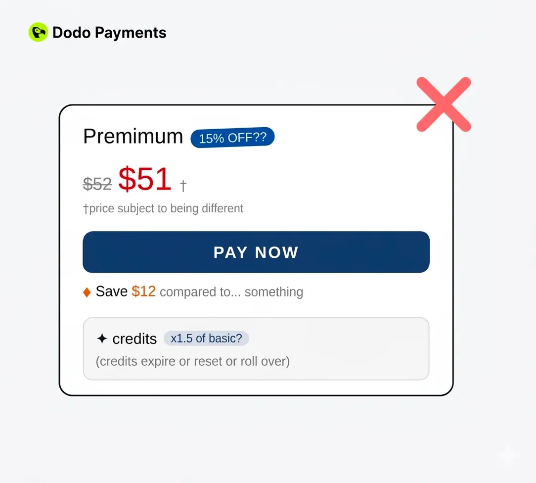
Nearly half of users leave the moment they see an unexpected cost. A fee that wasn’t mentioned earlier. Taxes that appear out of nowhere. That’s it. They’re gone.
1 in 5 people abandon because the page doesn’t feel secure. Not because it isn’t secure — because it doesn’t feel that way. The badge is there. The HTTPS is there. But the page looks janky enough that they don’t believe it.
And if your checkout isn’t mobile-friendly, you’re leaving money on a table that did $2.2 trillion in mobile commerce last year.
These aren’t edge cases. This is the norm. Happening quietly, every day, on thousands of products built by smart people who just didn’t prioritize this page.
Here’s what a Good Checkout Actually Needs
After studying a lot of B2B SaaS checkout flows, the patterns that separate the ones that convert from the ones that don’t come down to five things.
1. Be transparent about cost. Show the full price upfront. No hidden fees at the last step. If you have usage-based pricing, show a clear estimate. The #1 reason people abandon checkout is surprise costs. (And an AI agent parsing your DOM will flag this instantly.)
2. Minimize friction. Every extra form field is a chance for someone to reconsider. Let people pay first, create accounts later. Auto-detect country. Pre-fill what you can.
3. Ship trust signals that actually work. “Secure checkout” badges only work if the entire page design reinforces them. Consistent branding, familiar payment logos, and HTTPS are the basics. A mismatch between your polished landing page and a janky checkout actively destroys trust.
4. Support the payment methods your users expect. Cards, wallets, local payment methods. If their preferred option isn’t there, many users just leave. This is especially true for global products serving developers across 190+ countries.
5. Make it look like it belongs. If your checkout page uses different fonts, colors, and spacing than the rest of your product, users notice. Even subconsciously, it creates doubt. The best checkouts feel invisible because they look like the rest of the experience.
The best checkout pages do something interesting, they almost disappear. You don’t even think about the checkout. You just pay.
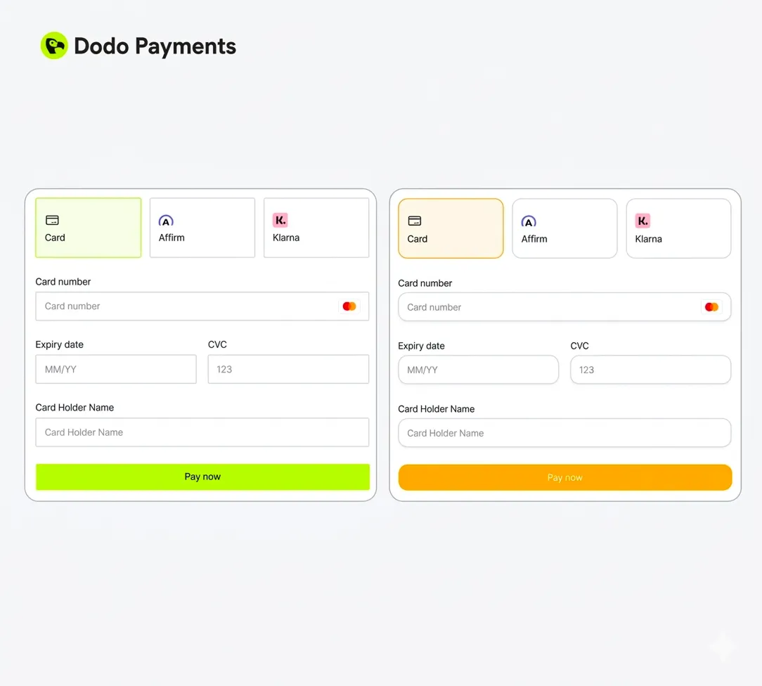
Interestingly, this is exactly what Dodo Payments focuses on, removing those small checkout frictions that quietly kill conversions in v1.86.0
Point 5 above is the one we kept hearing from customers. “My checkout looks nothing like my product.” “It works, but it feels off-brand.” “My users think they’re being redirected to a third-party site.”
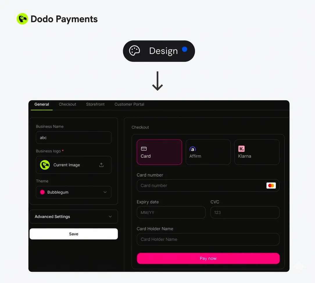
So we built a fix. You can now configure the look and feel of your checkout, storefront, and customer portal from a single Design page in the dashboard. One place. All three surfaces. No more hunting across different settings screens.
A few other things we shipped alongside this:
-
Credit-based billing – issue credits with subscriptions or one-time purchases, auto-deduct them from usage, and configure rollover or expiration rules. Customers can see their credit balance directly in the portal.
-
Refund & dispute visibility – refund and dispute status now appear directly in the payments list, so teams can filter, monitor, or trigger alerts without checking each payment individually.
How you can get there in about 30 seconds
If you want to try it out:
-
Go to Design in the main sidebar of your Merchant Dashboard.
-
Inside the Design page, you’ll see four tabs:
-
General – Set your business name, logo, choose a theme, and manage global settings.
-
Checkout – Customize the design specifically for the checkout page.
-
Storefront – Adjust the storefront layout and theme settings.
-
Customer Portal – Control how the customer portal looks.
-
Pick a Theme or Build Your Own
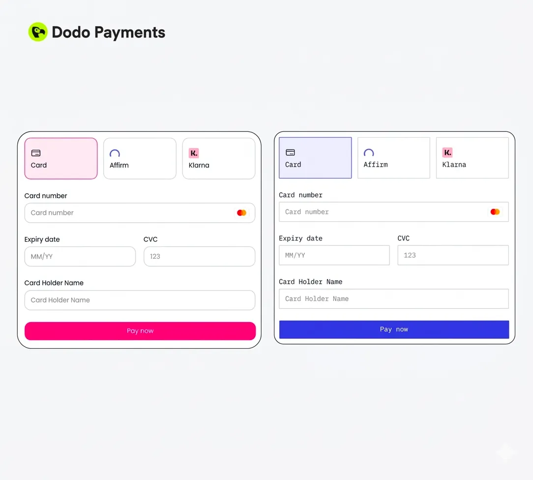
We ship four pre-built themes so you can go from default to branded in under 30 seconds:
-
Dodo Pulses — lime green, energetic, high-contrast. Great for consumer-facing AI tools.
-
Terminal — monospaced font, royal blue accent, dark by default. Built for dev tools. If your users live in a terminal, your checkout should feel like one too.
-
Bumblebee — warm amber tones, premium feel. Works well for prosumer and enterprise products.
-
Bubblegum — pink/magenta, rounded corners, modern and playful. Perfect for creative tools and design products.
Or skip the presets and build your own theme.
You can customize fonts, colors (light & dark mode), border styles, and section-specific designs for checkout, storefront, or customer portal. And with live preview, you can see exactly how everything looks before publishing.
You can tweak each part of the payment experience while keeping everything consistent with your brand. You can also expand Advanced Settings to access more granular controls if you want finer customization.
One Last Thing
No matter how much AI gets involved in transactions and it’s going to get very involved, there will always be a human somewhere in the loop. Payments are personal. People are careful with money in a way they aren’t careful with almost anything else.
That’s not going to change.
Every checkout you ship is a small bet on trust. Good infrastructure gets you halfway there, the other half is a page that feels like it was built by people who actually care.
Make that bet count!
And while we’re on the topic of builders thinking about pricing and checkout…
A little brain teaser for the builders. No Googling. First correct answer in our Discord gets a transaction fee waved off for $500!
I’m the reason your user said yes - but I’m also the reason they never paid. I’m not the product, not the price, and not the ad that brought them in. I show up at the very end, and when I’m ugly, the deal dies. What am I?
Think you know? Drop your answer in #newsletter on Discord.
Answer revealed next issue.
Also, join our loving Discord community!
Best,
Rishabh Goel
Co-Founder,
Dodo Payments
More Articles
Mar 5, 2026
The Dodo Digest: Usage pricing makes users calculate. Credits make them commit.
Feb 11, 2026
The Dodo Digest: Be the damn penguin 🐧 | New from Dodo Payments + your most-requested feature
Jan 23, 2026
